iOS Crystalline Blurred Backgrounds with CSS Backdrop Filters
📣 Sponsor
iOS is full of cool 'crystaline' glass effects. This effect has long been easy to do when you have easy access to graphic shaders, since these can do most of the heavy lifting in terms of calculating what is underneath the layer, and blurring it into the foreground. However, for a long time it hasn't been possible in CSS - until now.
In more recent specifications of CSS, we have finally gotten backdrop-filter. Mostly meant for modals, it also has applications on stylised dropdowns which are common across the web.
In this tutorial we'll be looking at how to make a tinted blurred glass effect with just modern CSS.
How it works
To highlight exactly what this looks like, I've put together a demo of the functionality. Note: as shown in the support tables at the bottom, Firefox won't display these correctly - so better to check out in a Webkit or Blink based browser like Chome or Safari.
Each of these use pure CSS - but you can see the background image blur through to the dropdown, creating a pretty cool crystalline, see through, blurred effect.
To understand a bit more about how this works, I've copied the code below. The CSS property on the notification style to check out is backdrop-filter - this applies a filter to the background layer. We can use any filter here, but here we use blur(33px) to blur the transparent background color.
CSS
.effect-holder {
    height: auto;
    width: calc(33.3% - 1rem);
    border-radius: 16px;
    float: left;
    background-size: 100%;
    background-repeat: no-repeat;
    background-image: url(image.png);
}
.dropdown-style {
    margin: 0 1rem 0 0;
    background-color: #ffffff7d;
    margin: 2rem;
    border-radius: 12px;
    padding: 1rem;
    position: relative;
    box-shadow: 0 10px 15px rgb(0 0 0 / 20%);
    box-sizing: border-box;
    width: calc(100% - 4rem);
    color: rgba(0,0,0,0.8);
    backdrop-filter: blur(33px);
    background-blend-mode: overlay;
    display: flex;
    align-items: center;
}

.dropdown-style > img {
    width: 32px;
    margin: 0 1rem 0 0;
}
HTML
<div class="effects">
    <div class="effect-holder">
        <div class="dropdown-style">
            <img src="" alt="">
            <span>Some Message</span>
        </div>
    </div>
    <div class="effect-holder dark">
        <div class="dropdown-style black">
            <img src="" alt="">
            <span>Some Message</span>
        </div>
    </div>
    <div class="effect-holder">
        <div class="dropdown-style black">
            <img src="" alt="">
            <span>Some Message</span>
        </div>
    </div>
</div>
Other filters and mix modes
Since we can use backdrop-filter works in the same way as filter, and we also have access to mix-blend-mode, we can do some other cool effects. Here's an example with see-through text by using a lighten blend mode:
.el {
    mix-blend-mode: lighten;
    backdrop-filter: blur(33px);
}
The notification center
It wasn't really enough for me to try out using this to make a simple notification style demo. So I tried something a little bit bigger and made the Mac OS notification center using this effect. It doesn't exactly mimic what they have there, but it is a cool example of how this effect could be deployed in more complicated frontend user experiences.
Support
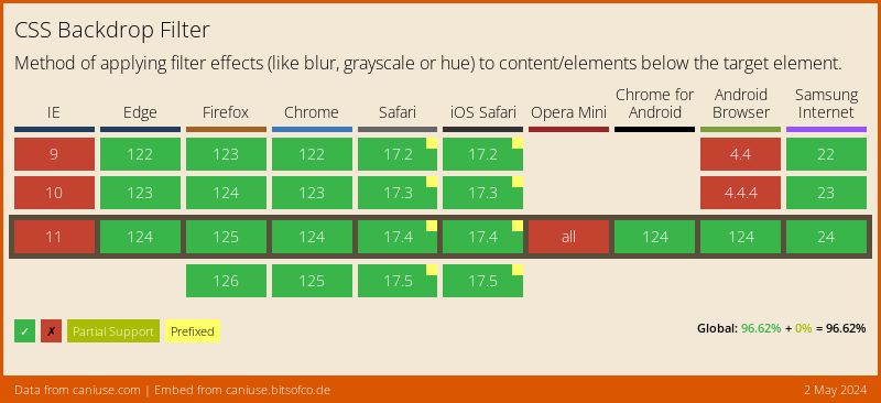
As with all new features, backdrop-filter doesn't have complete support. However, it does have enough support to warrant its use in projects today. The only major browser without support is Firefox, which can be enabled in the Firefox flags for experimentation.
Conclusion
This new CSS property is pretty neat, and it degrades gracefully in browsers that don't support it. I hope you've enjoyed this short look into it. If you want to see the source code for the final demo, check it out via the Codepen link here.
More Tips and Tricks for CSS
- Automating CSS Dark Mode
- A Guide to CSS Selectors
- What are Variable Fonts in CSS, and How to Use Them
- Parent Selection in CSS: how the CSS has selector works
- iOS Crystalline Blurred Backgrounds with CSS Backdrop Filters
- CSS Media Queries
- A Complete Guide to How the CSS not Selector Works
- CSS Only Masonry Layouts with Grid
- How to disable text selection in CSS
- CSS Introduction
